By Cindy Schwall
Most homeowners think about color in terms of what looks good. Color psychology asks a different question: how do you want each room to feel? The two approaches are not mutually exclusive, but the second one produces better results. When the colors in a home are chosen with intention — matched to the function of each room and the mood it's meant to support — the effect on daily life is real and measurable. For Scarsdale homeowners thinking about a refresh, a renovation, or getting a property ready for sale, understanding what color actually does is a useful place to start.
Key Takeaways
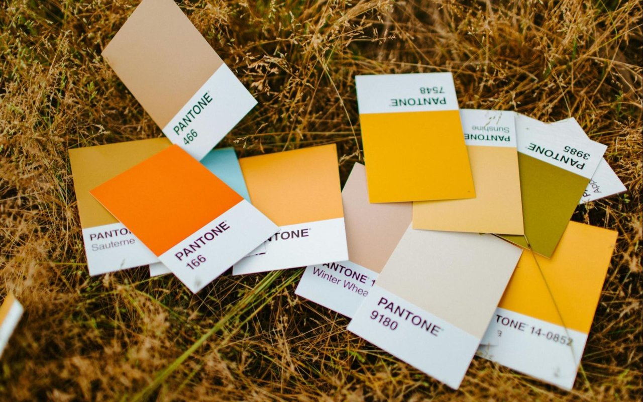
- Color psychology is the study of how different hues influence mood, behavior, and perception of space — and it has direct applications in residential interior design.
- Warm tones (reds, oranges, yellows) energize and stimulate social interaction; cool tones (blues, greens, purples) calm, focus, and expand the sense of space.
- Lighting — both natural and artificial — significantly affects how a color reads in a room. North-facing rooms, common in older Scarsdale homes, benefit from warmer palettes.
- Paint is one of the highest-return updates a homeowner can make, with research indicating that the right color choices can measurably increase a home's perceived value and sale price.
- Consistency across rooms matters as much as individual color choices — flow between spaces creates a sense of coherence that buyers and residents respond to.
Understanding Warm and Cool Tones
The emotional foundation of color selection
Every color sits somewhere on a spectrum between warm and cool, and each end of that spectrum produces different psychological effects that have been documented in behavioral and environmental psychology research.
- Warm colors — reds, oranges, yellows, and their derivatives — stimulate energy, increase appetite, and encourage conversation. They raise physiological arousal in measurable ways and are most effective in social spaces where activity and connection are the goal.
- Cool colors — blues, greens, and softer purples — slow the pace down. They lower stress responses, reduce heart rate, and create environments that feel calm, open, and restorative. Blues in particular have the broadest appeal of any hue in color preference research and work well across multiple rooms.
- Neutrals — whites, grays, beiges, and warm creams — serve as the connective tissue of a home's palette. They allow bolder choices elsewhere to breathe, provide balance, and let furniture, artwork, and architectural details read clearly.
Understanding which effect you want before choosing a color is more reliable than selecting by intuition alone.
Room-by-Room Guidance
Matching color to function in every space
Each room in a home has a purpose, and color choices that align with that purpose produce spaces that feel right rather than just look right.
- Living rooms: Warm neutrals — beige, taupe, warm white — promote relaxation and make conversation feel natural. Soft greens and muted blues reduce the stress response and work particularly well in rooms with a lot of natural light. For Scarsdale homes with traditional architecture, a warm cream or greyed sage reads as classic rather than dated and holds up well across seasons.
- Kitchens: Kitchens benefit from colors that feel clean, energizing, and welcoming. Soft yellows and warm whites work for lighter palettes; olive green has performed well in recent buyer preference data as an update to the all-white kitchen that defined the previous decade.
- Bedrooms: The primary function is rest, and the palette should support it. Soft blues — powder blue, dusty blue, slate — are the most consistent performers for promoting relaxation. Muted sage, lavender, and greyed taupes also work well. Avoid highly saturated or warm colors in rooms meant for sleep.
- Home offices: A space that requires focus benefits from cooler tones. Soft blue-greens have shown the strongest performance for productivity in controlled studies, with blue generally supporting concentration and calm. A too-stark white can actually be counterproductive — a slightly warmer tone reduces eye fatigue over long hours.
- Dining rooms: Rich, warm colors — deep burgundy, terracotta, warm red — stimulate appetite and encourage the kind of energy that makes meals feel like an occasion. These are among the few spaces where deeper, more saturated hues pay off.
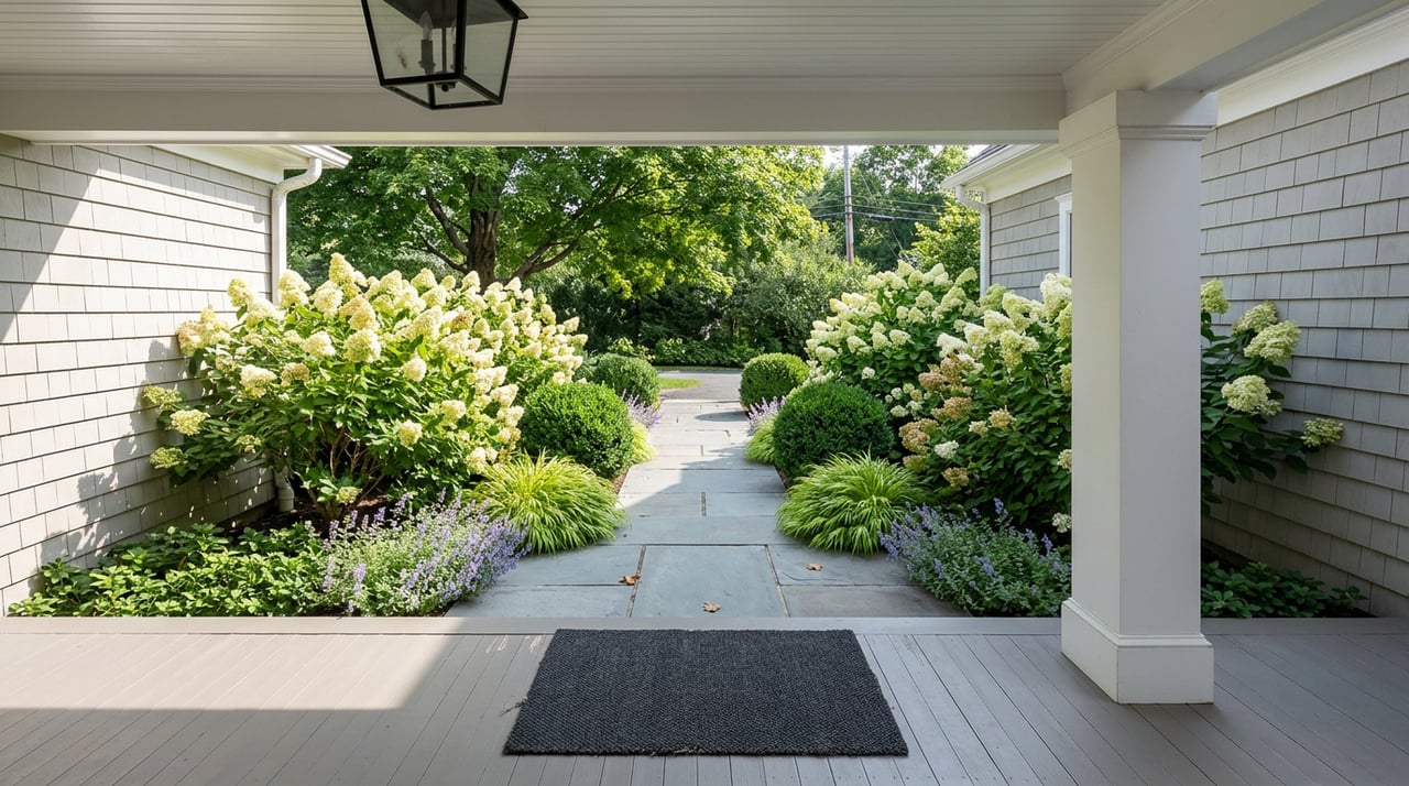
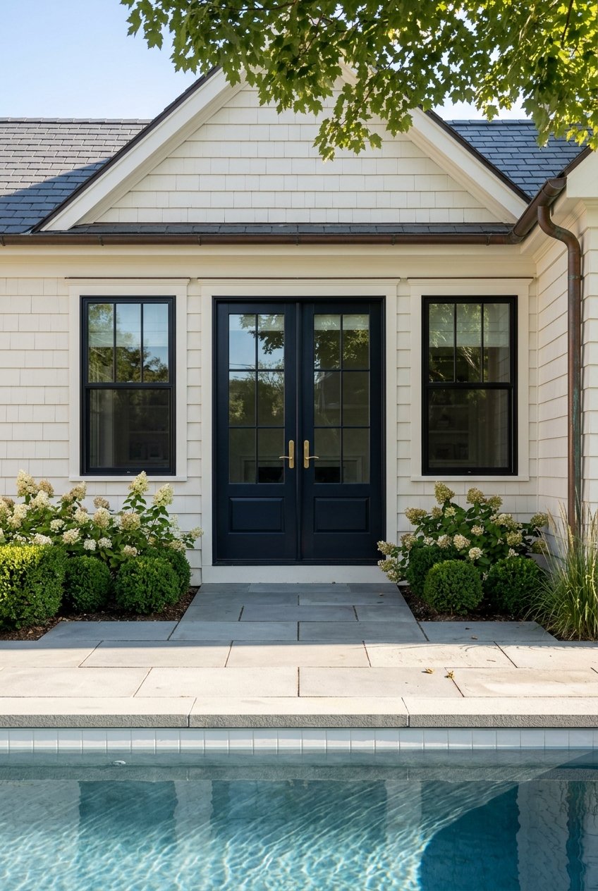
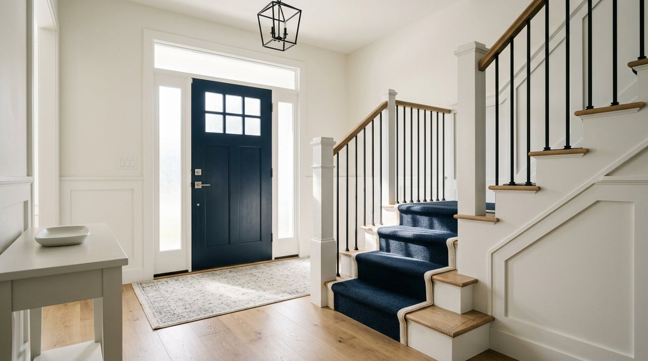
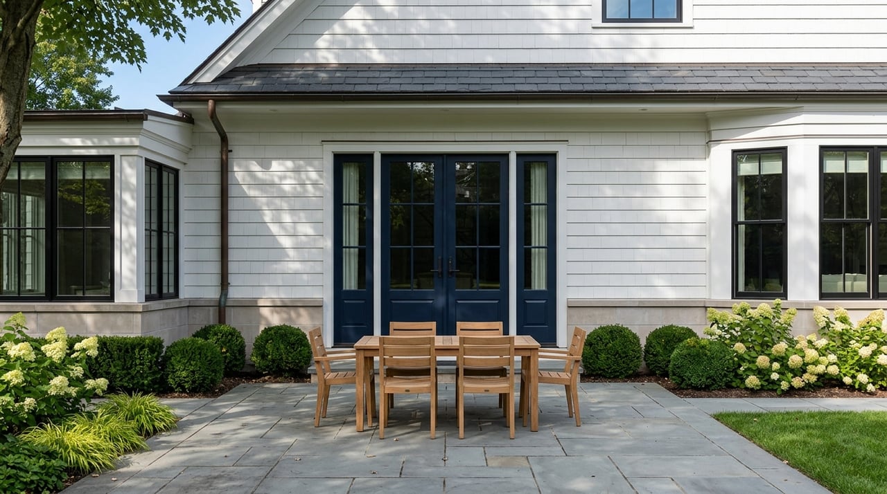
- Entryways: The entry is the first impression, and the color sets the tone for the rest of the home. Deep jewel tones — emerald, navy, charcoal — convey confidence and make a statement. Warm neutrals paired with interesting trim or millwork work equally well in Scarsdale's Tudor and Colonial homes, which have strong architectural bones worth highlighting.
Lighting Changes Everything
Why the same color looks different in different rooms
Color cannot be evaluated in isolation — it has to be understood in the context of a specific room's light. The same paint chip looks different in a north-facing room than a south-facing one, and different again at noon versus 6 PM.
- North-facing rooms receive cool, indirect light throughout the day. Warm tones help counteract that coolness and prevent a room from feeling dim or flat. Older Scarsdale homes often have north-facing formal rooms that benefit significantly from a warmer palette.
- South-facing rooms have abundant warm natural light. They amplify warm tones and soften cool ones — a muted blue that looks gray in a north-facing room can look crisp and clear with southern exposure.
- Artificial lighting interacts with color just as natural light does. Warm-spectrum bulbs enhance reds, oranges, and golds and add coziness. Cool-spectrum bulbs make blues and greens feel sharper and more modern.
Always test a paint color in the specific room, at multiple times of day and under the artificial light you'll actually use, before committing.
Color and Resale Value
What the data says about the financial dimension of color choices
Color is not just a lifestyle decision for homeowners thinking about eventual sale. Research on buyer preferences has found measurable effects on perceived value and final sale price for specific color choices.
- Navy blue bedrooms and dark gray living rooms have been associated with higher buyer offers in recent research, outperforming lighter equivalents in the same rooms.
- Olive green kitchens have tested well with buyers as a contemporary alternative to all-white.
- Fresh interior paint consistently delivers one of the highest returns on investment of any pre-listing improvement, with returns frequently exceeding the cost of the work.
- Overly personalized or highly saturated color choices — while potentially rewarding to live with — can work against resale by narrowing the pool of buyers who can see themselves in the space.
If you are painting ahead of a sale, a straightforward approach is to choose colors that are sophisticated, current, and work with the home's architecture rather than against it.
FAQ
How do I choose a whole-home color palette that flows well?
Start by identifying one or two anchor colors — typically the living areas and any spaces that are visible from multiple rooms. Then select adjacent colors that share undertones with those anchors. A warm greige living room flows naturally into a warm white hallway and a soft taupe dining room. The goal is for transitions to feel intentional rather than abrupt.
What colors work best for older homes with traditional architecture, like many in Scarsdale?
Scarsdale's inventory skews toward Tudors, Colonials, and Craftsman-style homes with strong architectural detail. Colors that honor that character — warm creams, soft sage, deep navy, greyed greens, and classic white with warm undertones — tend to work better than stark or highly contemporary palettes. When in doubt, look to the exterior for cues about what undertones to carry inside.
How do I know if a color will look different once it's on the wall?
It almost certainly will. Paint chips are small, viewed under store lighting, and surrounded by other colors — all of which affect perception. Buy sample pots of your top two or three choices, paint large test swatches (at least 12 by 12 inches) directly on the wall, and evaluate them over several days at different times. This is the only reliable way to know how a color behaves in a specific room before committing.
Sell or Refresh Your Scarsdale Home With Confidence
Color is one of the most accessible and highest-return tools a homeowner has — whether the goal is to make a home feel more like yours or to position it to perform at its best for sale. I've helped Scarsdale homeowners through both scenarios for more than two decades, and I know what reads well to buyers in this specific market.
If you're thinking about what updates to make before listing, or simply want a local perspective on what works in Scarsdale homes, I'm glad to be a resource.
Reach out to me to learn more about how I prepare and market Scarsdale homes for sale.