By Cindy Schwall
Choosing paint colors comes down to more than personal taste; it comes down to how light actually behaves in a room. Understanding how to choose paint colors for your home starts with a simple concept called light reflectance value, and once you understand it, color choice stops feeling like guesswork. Here is the science behind picking the right tone for every room in a Scarsdale home.
Key Takeaways
- Light reflectance value, or LRV, measures how much light a paint color bounces back, on a scale from 0 for pure black to 100 for pure white.
- North-facing rooms generally need higher LRV colors, typically in the 60 to 80 range, to offset their cooler, dimmer natural light.
- Older homes with deep-set or leaded glass windows, common in Scarsdale's Tudor and Colonial Revival homes, often need higher LRV choices than a room's size alone would suggest.
- Different room functions call for different LRV ranges, from 60 or higher in work areas to a cozier 35 to 65 range in eating spaces.
Understanding Light Reflectance Value
Every paint color has a light reflectance value, a number that predicts exactly how light or dark that color will actually appear once it is on your walls. This single number explains why the same beige can look warm in one room and washed out in another.
What LRV Actually Tells You
- LRV runs on a 0 to 100 scale, with black sitting near zero and pure white near 100
- A color with an LRV of 50 reflects roughly half the light that reaches it
- Colors with lower LRVs, generally in the 20s and 30s, absorb more light than they reflect, making rooms feel cozier and more enclosed
- Designers often aim for wall LRVs at least 10 points lower than white trim or ceilings, since too little contrast makes a room look visually flat
Once you know a color's LRV, you can predict how it will behave in your specific room before a single can gets opened.
Matching Paint to Room Orientation
Which direction a room's windows face changes how any given color will actually read on the wall. This is one of the most overlooked factors in paint selection.
How Orientation Should Guide Your Choice
- North-facing rooms receive cool, indirect light all day, so colors in the 60 to 80 LRV range with warm undertones help offset that chill
- South-facing rooms get warm, direct light for much of the day and can handle a much wider range of LRVs, including cooler whites that would feel cold elsewhere
- East-facing rooms get bright, cool morning light that shifts warmer by afternoon, so mid-range LRVs tend to perform consistently throughout the day
- West-facing rooms shift toward golden, warm light in the evening, which can intensify already warm paint colors as the day goes on
Testing a color at multiple times of day in the actual room remains the only reliable way to confirm how it will behave once it's fully painted.
Choosing Colors for Scarsdale's Older Homes
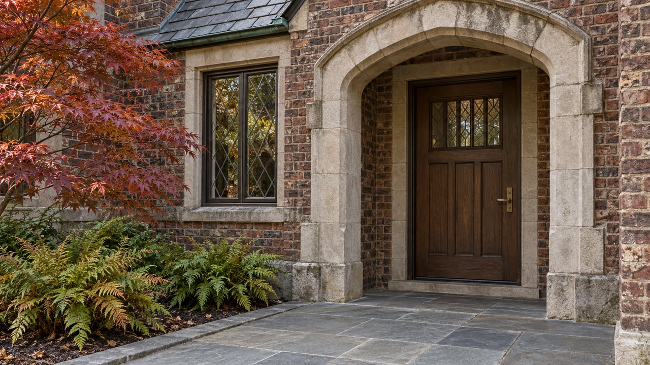
Many Scarsdale homes were built in the 1910s through 1940s in Tudor and Colonial Revival styles, and their window design directly affects how paint colors read indoors. Leaded glass, smaller panes, and deep-set window wells all reduce the amount of natural light reaching interior walls compared to a modern build.
Adjusting for Period Architecture
- Tudor-style rooms with leaded or diamond-paned glass often need a higher LRV than the room's size alone would suggest, since less light passes through smaller panes
- Deep window wells, common in older brick and stucco construction, can create shadowed areas that make mid-tone colors read darker than expected
- Rooms with dark wood trim or beams benefit from wall colors with enough LRV contrast to keep the architectural detail from disappearing into the walls
- In rooms with abundant true divided-light windows, this reduced natural light effect is less pronounced, since more total glass compensates for smaller individual panes
Accounting for these period details before painting can prevent the disappointment of a color that looked bright at the paint counter and dim once applied.
Room-by-Room Color Strategy
Beyond orientation and architecture, a room's actual function should influence its LRV range. A home office and a primary bedroom have very different lighting needs.
General LRV Guidelines by Room Type
- Work areas like home offices and kitchens generally benefit from an LRV of 60 or higher, supporting visibility for detailed tasks
- Eating areas, including kitchens and dining rooms, tend to feel most comfortable in the 35 to 65 LRV range
- Small spaces like powder rooms or mudrooms often benefit from a higher LRV, roughly 65 or above, to keep the space from feeling cramped
- Larger, more formal rooms can handle a wider 40 to 60 range, giving more flexibility in color choice
Matching LRV to function, not just aesthetics, is often the difference between a color that photographs well and one that actually feels right to live with.
Frequently Asked Questions
What is a good LRV for a north-facing room?
Generally 60 to 80, with warm undertones, to help offset the cool, consistent light these rooms receive throughout the day.
Do older homes need different paint colors than newer construction?
Often yes, since older homes with smaller or leaded windows typically let in less natural light, which can call for a higher LRV than the room's size alone would suggest.
Can the same paint color look different in two rooms?
Yes. The same color can appear noticeably different depending on window orientation, window size, and the amount and type of natural light each room receives.
Work With Someone Who Understands Scarsdale's Homes
Since 2002, my business has focused on personalized attention to client goals, total transparency, and clear, comprehensive communication that delivers real results. My enthusiasm, professional expertise, market knowledge, and attention to detail help me consistently exceed client expectations with the highest level of service. Having lived in Scarsdale for over 25 years and raised my family here, I understand these homes and their architecture intimately, staying active through the PTA, Junior League, and the Maroon & White High School Booster Club, among other organizations. If you are looking for a Scarsdale home with the light and character to bring your color choices to life, I would love to help.
Connect with Cindy Schwall today.
Connect with Cindy Schwall today.